
In this lesson, you'll learn how to create boxplots in Python using matplotlib.
The Imports We'll Need For This Lesson
As before, the code cells in the lesson will assume that you have already performed the following imports:
import matplotlib.pyplot as plt

%matplotlib inline

import pandas as pd
The Dataset We Will Be Using In This Lesson
In our first lesson on using pyplot, we used fake datasets generated using NumPy's random number generator. While this can be useful for educational purposes, it is time for us to begin working with a real-world dataset.
Specifically, we will be working with the famous Iris data set. This data set was produced by English statistician Ronald Fisher in 1936 (!!) when he was writing one of the first papers on linear discriminant analysis.
The Iris dataset is so commonly used for machine learning and deep learning practice that it is actually included in many data visualization and statistical libraries for Python. However, we are not using any of those libraries. Because of this, we will import the Iris dataset manually.
To make things easy for you, I have uploaded a json file containing the iris dataset to the GitHub repository for this course. You can find it in the folder iris with the filename iris.json.
You can import this dataset into your Python script using the following command:
import pandas as pd

iris_data = pd.read_json('https://raw.githubusercontent.com/nicholasmccullum/python-visualization/master/iris/iris.json')
The iris data set is a collection of data points for flowers with the following data fields:
sepalLengthsepalWidthpetalLengthpetalWidthspecies
It is an ideal candidate for creating boxplots using matlpotlib.
How To Create Boxplots in Python Using Matplotlib
We will now learn how to create a boxplot using Python. Note that boxplots are sometimes call 'box and whisker' plots, but I will be referring to them as boxplots throughout this course.
First, what is a boxplot?
A boxplot is a chart that has the following image for each data point (like sepalWidth or petalWidth) in a dataset:
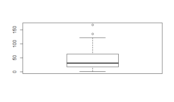
Each specific component of this boxplot has a very well-defined meaning. They are labeled in the following image.
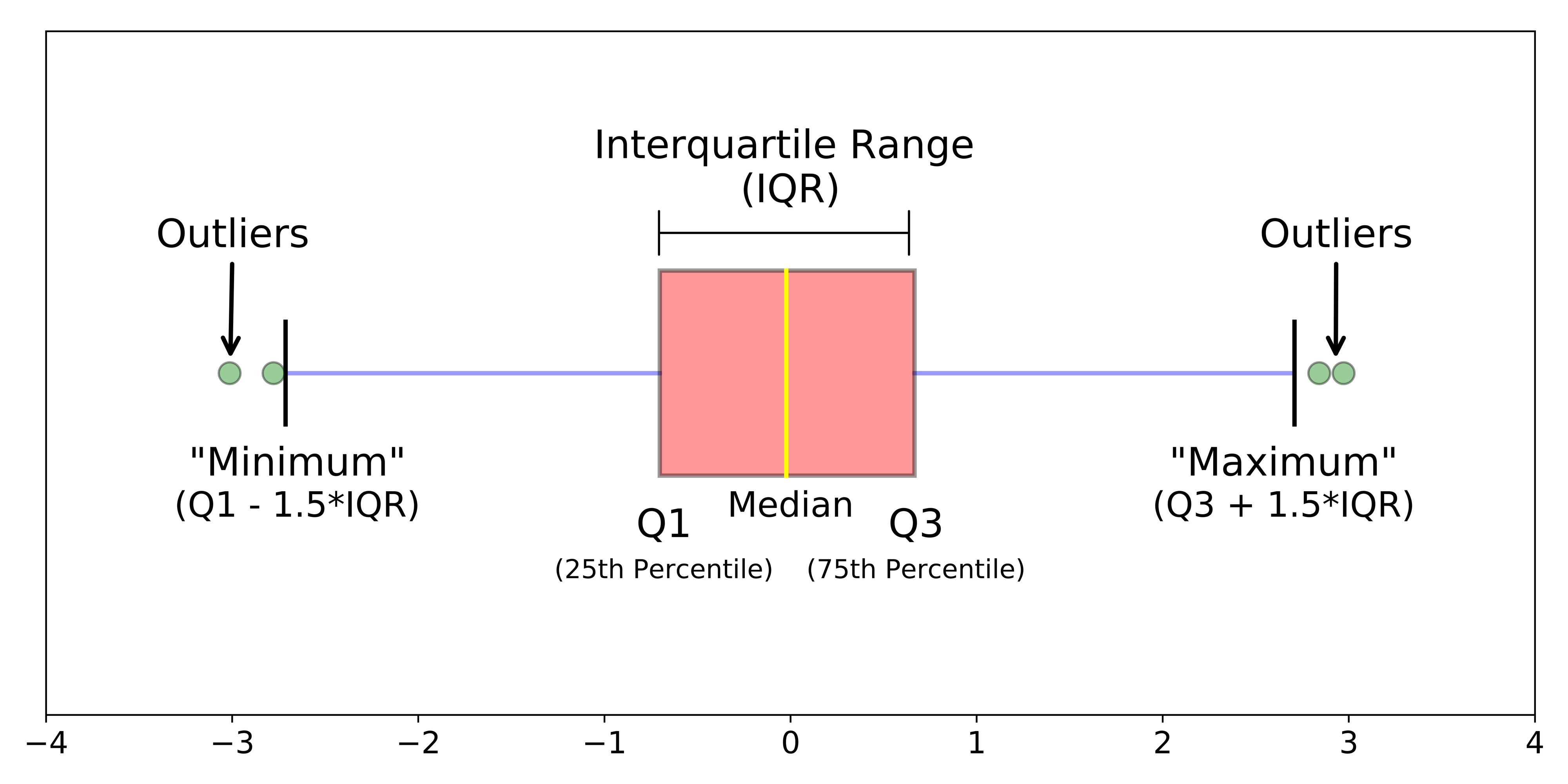
For those unfamiliar with the terminology of this diagram, they are described below:
- Q1: The first quartile of the dataset. 25% of values lie below this level.
- Q2: The second quartile of the dataset. 50% of values lie above and below this level.
- Q3: The third quartile of the dataset. 25% of values lie above this level.
- The boxplot 'Minimum', defined as Q1 less 1.5 times the interquartile range.
- The boxplot Maximum, defined as Q3 plus 1.5 times the interquartile range.
- The median: the midpoint of the datasets.
- Interquartile range: the distance between Q1 and Q3.
- Outliers: data points that are below Q1 or above Q3.
So how can we actually create a boxplot using matplotlib?
First, we will have to drop any non-numerical columns from the iris_data DataFrame.
The only column that is non-numerical is species.
We can drop species from iris_data using the drop method, like this:
iris_data = iris_data.drop('species', axis=1)Now that the dataset contains only numerical values, we are ready to create our first boxplot!
You can create a boxplot using matlplotlib's boxplot function, like this:
plt.boxplot(iris_data)The resulting chart looks like this:
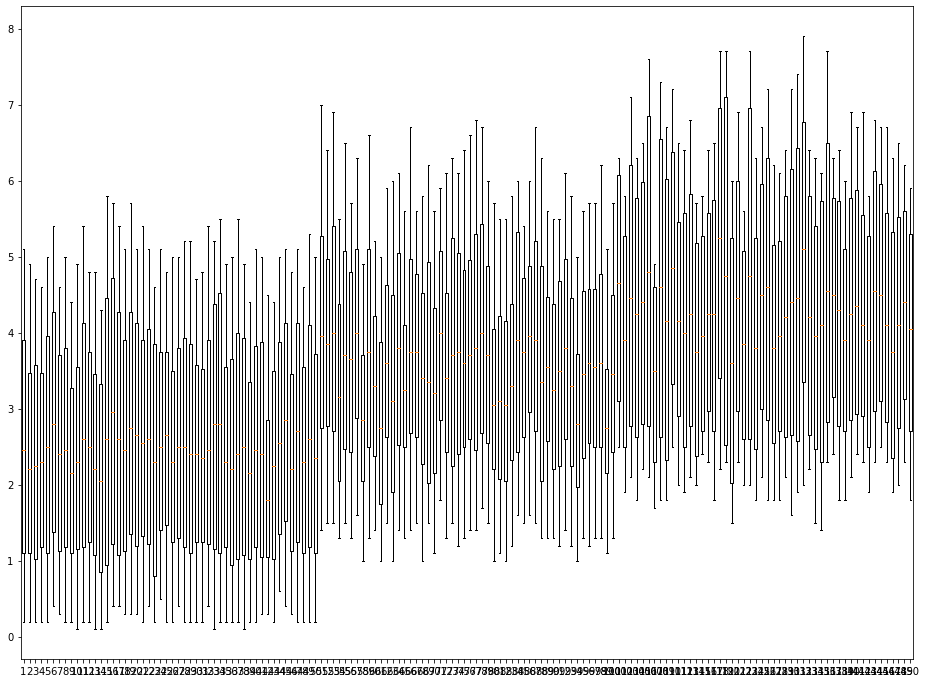
As you've probably guessed, this is not what we wanted our boxplot to look like! What is the solution?
If you look closely at this chart, it becomes clear that this is creating a boxplot where there is a chart for each row, not a chart for each column. The solution for this is to transpose the DataFrame using the transpose method.
You can either do this in separate lines, like this:
transposed_iris_data= iris_data.transpose()

plt.boxplot(transposed_iris_data)
Alternatively, you can transpose the DataFrame within the boxplot method like this:
plt.boxplot(iris_data.transpose())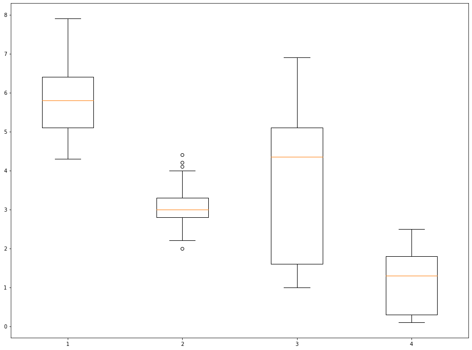
This looks much better!
However, we still have work to do.
One of the problems that remains is that the x-axis is not labeled. It is currently unclear which boxplot represents which data point.
We can modify the labels of the x-axis using matplotlib's xticks method. The xticks method takes two arguments:
ticks: A list of positions at which the labels should be placed.labels: A list of explicit labels to place at the given ticks.
Note that each of these arguments must be a list - which means they begin with [ and end in ]. As an example, you could label the 2nd entry as 'The Second Entry!' with the following xticks command:
plt.xticks([2], ['The Second Entry!'])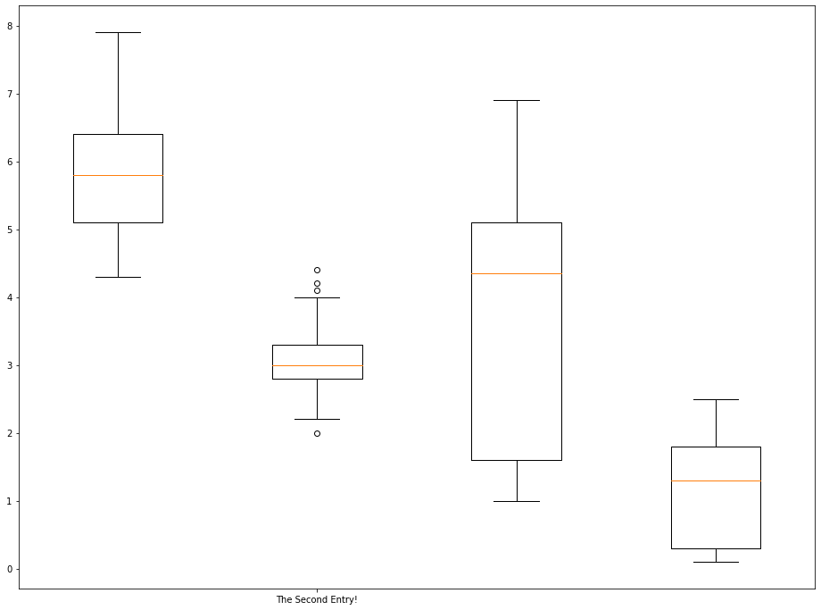
If you wanted to label each boxplot with its corresponding datapoint, your arguments should look like this:
ticks:[1, 2, 3, 4]labels: ['sepalLength', 'sepalWidth', 'petalLength', 'petalWidth']
Typing out these arguments by hand is not ideal. It does not scale to larger datasets with many more datapoints per observation.
Because of this, it is a good idea to learn how to programmatically generate the ticks and labels arguments in a way that would be repeatable for large databases.
Let's start by programmatically creating the ticks argument:
ticks = range(1, len(iris_data.columns)+1)This statement uses the range function to create a list from 1 to 4 (inclusive), since the value of iris_data.columns is 4.
Next, let's create the labels argument:
labels = list(iris_data.columns)A brief explanation of this code cell is below:
- First, we create an object that contains all of the column names using the pandas DataFrame
columnsattribute. - Next, we force this object into a
listdata structure using thelistfunction.
With all this done, we can relabel the x-axis as follows:
plt.boxplot(iris_data.transpose())

plt.xticks(ticks,labels)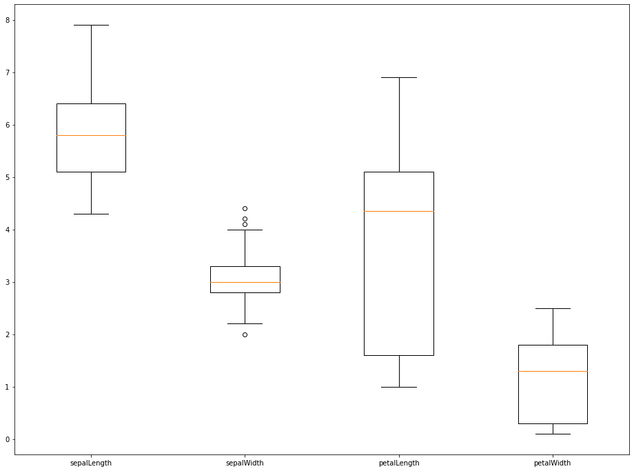
That plot looks much better! In the next section, we will explore how to style boxplots using various methods available in matplotlib.
Customizing The Appearance of Boxplots
There are a number of ways that we can customize the appearance of boxplots created using matplotlib. We will discuss a few methods in this section.
First, we can pass in the showmeans=True argument to show the means of the datasets we're displaying. An example is below:
plt.boxplot(iris_data.transpose(),showmeans=True)

plt.xticks(ticks,labels)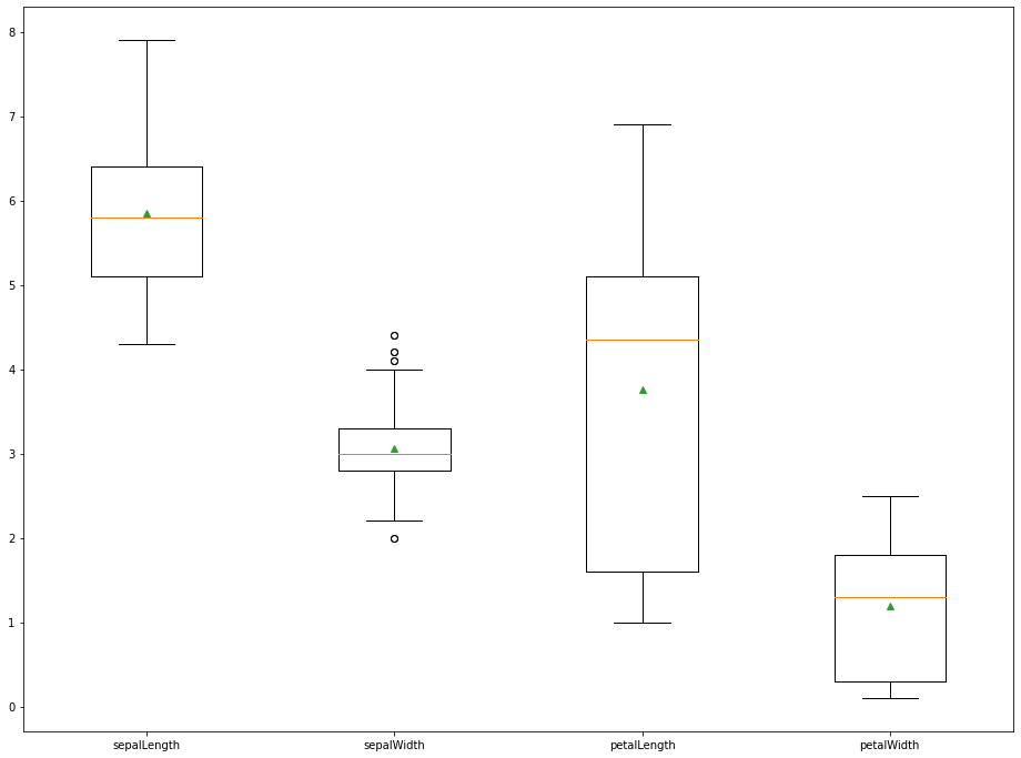
We can also use the showfliers=False argument to remove the outliers from the chart. An example is below:
plt.boxplot(iris_data.transpose(),showfliers=False)

plt.xticks(ticks,labels)
The last two arguments that we will explore are boxprops and flierprops, which change the appearance of the box within the boxplot (for boxprops) and the outliers within the boxplot (for flierprops).
Both boxprops and flierprops must be passed into the boxplot method as a dictionary. Because of this, it is easiest to create these variables outside of the boxplot method, like this:
boxprops = dict(linestyle='--', linewidth=3, color='darkgoldenrod')Once this is done, you can create the actual plot and incorporate the boxprops dictionary like this:
plt.boxplot(iris_data.transpose(), boxprops=boxprops)

plt.xticks(ticks,labels)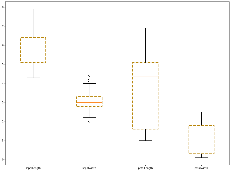
The flierprops argument works in a similar manner. We first create the flierprops dictionary outside of the boxplot method, like this:
flierprops = dict(marker='o', markerfacecolor='green', markersize=12, linestyle='none')Then we pass it into the boxplot method:
plt.boxplot(iris_data.transpose(), boxprops=boxprops, flierprops=flierprops)

plt.xticks(ticks,labels)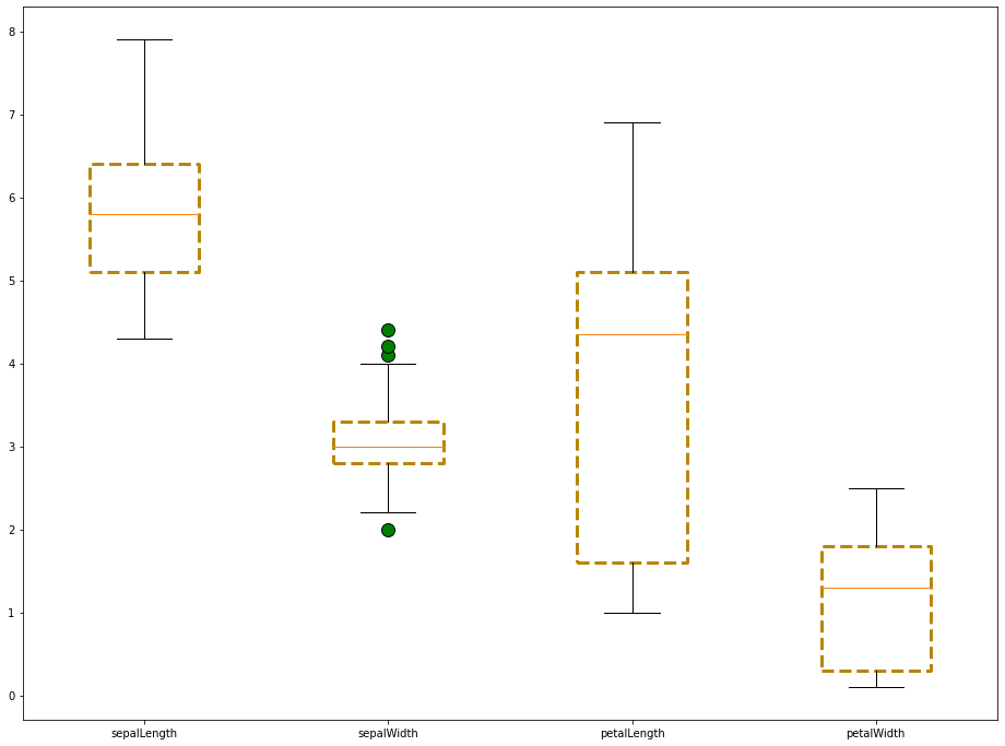
Moving On
In this lesson, we learned how to import the Iris dataset and create boxplots with it. We also learned how to style boxplots using the properties of matplotlib's boxplot method.