
In this lesson, you will learn how to create histograms in Python using matplotlib.
The Imports You Will Need For This Lesson
As before, you will require the following imports to be able to complete this lesson:
import matplotlib.pyplot as plt

%matplotlib inline

import pandas as pd

from IPython.display import set_matplotlib_formats

set_matplotlib_formats('retina')
You will also need the iris data set. You can import the Iris data set with the following code:
iris_data = pd.read_json('https://raw.githubusercontent.com/nicholasmccullum/python-visualization/master/iris/iris.json')What is a Histogram?
A histogram is a visualization that shows the prevalence of numerical data over a distribution. The horizontal axis is a particular value, and the vertical axis displays how many times that value was observed in the data set.
An example of a histogram is below. As you'll see, colors are used to differentiate between two subsets within the data.
One key concept that you must understand when working with histograms is the idea of bins - how many parts the total range of the data set is divided into. Changing the number of bins in a histogram does not change the data set. It only changes the appearance of the data in the histogram.
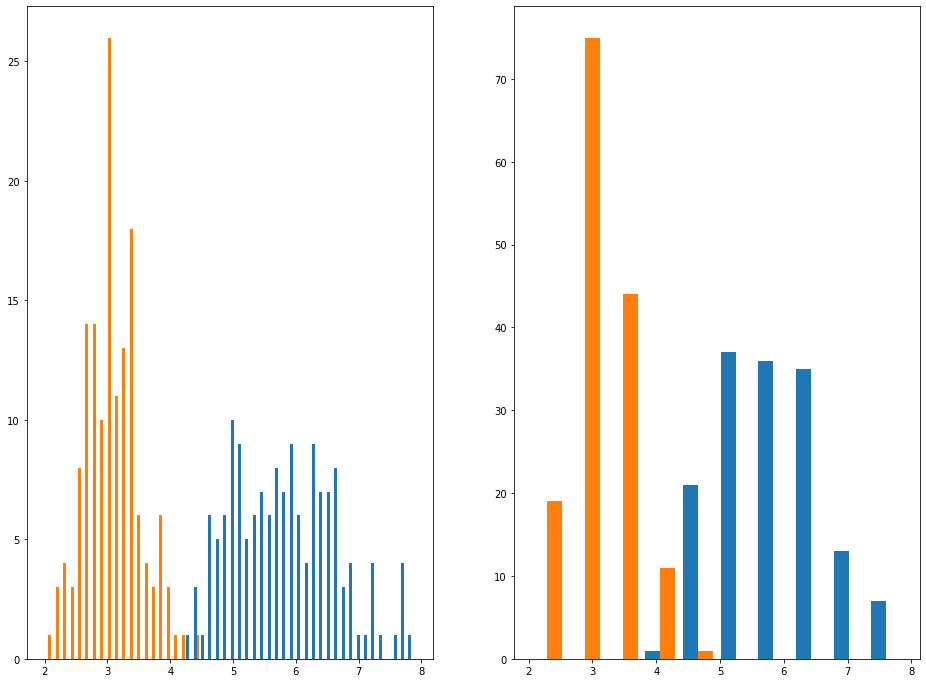
An example is helpful. Below, you can see two histograms. The histogram on the left has 50 bins and the histogram on the right has 10 bins.
In the next section, you'll learn how to create histograms in Python using matplotlib.
How To Create Histograms in Python Using Matplotlib
We can create histograms in Python using matplotlib with the hist method.
The hist method can accept a few different arguments, but the most important two are:
x: the data set to be displayed within the histogram.bins: the number of bins that the histogram should be divided into.
Let's create our first histogram using our iris_data variable.
We will first need to remove all non-numeric columns from the data set. Since the only non-numeric column is species, we can drop species from the DataFrame with the following command:
iris_data.drop('species',axis=1)We can either assign this to a new variable (using a command like new_iris_data = iris_data.drop('species',axis=1)) or we can pass it directly into the plt.hist() method. I prefer the second option:
plt.hist(iris_data.drop('species',axis=1))Here is what the resulting chart looks like:
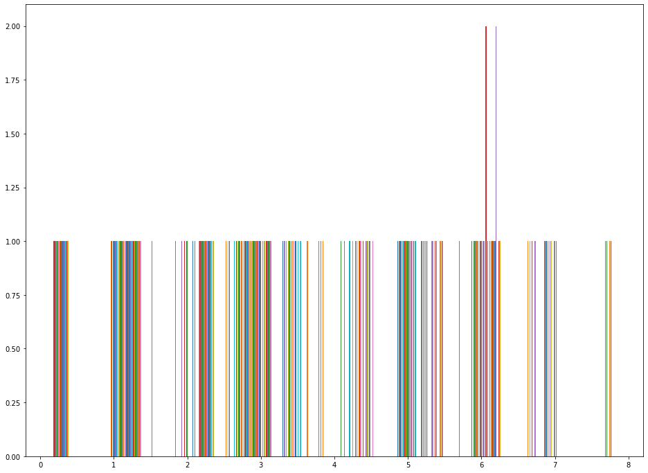
This does not look right!
The reason why is because this histogram is plotting along the rows instead of along the columns. We can fix this by applying the transpose method to the DataFrame, like this:
plt.hist(iris_data.drop('species',axis=1).transpose())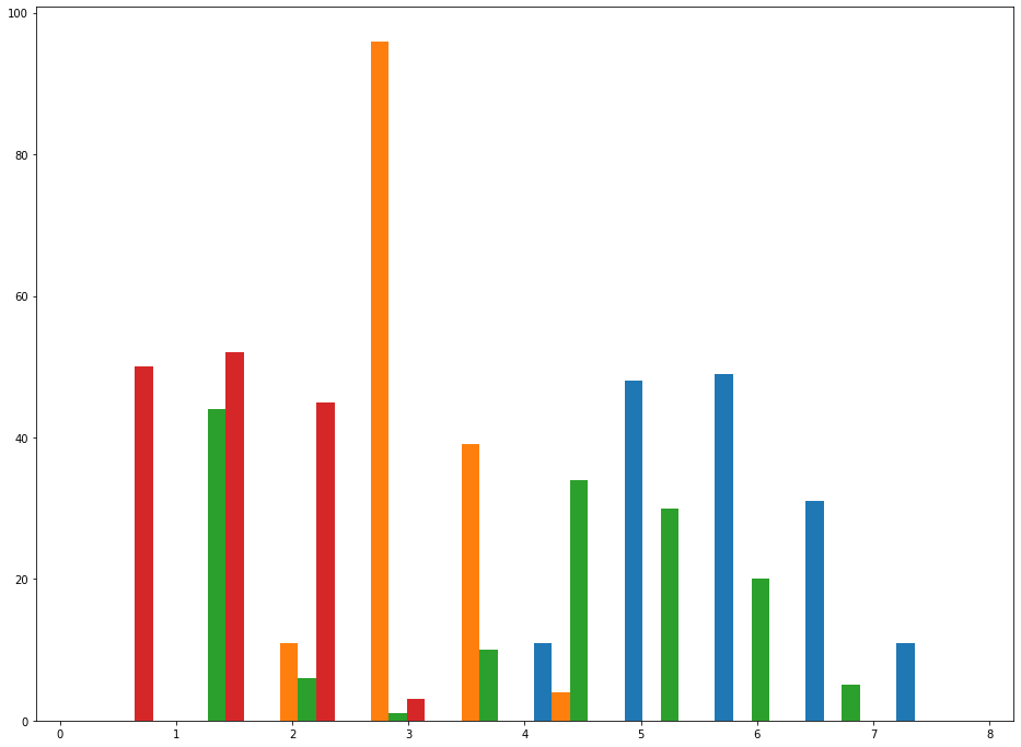
This is a good start, but we can significantly improve on the appearance of this graph by adding a title to the graph, titles to its axes, and a legend. I used the following code to all these elements:
plt.legend(iris_data.drop('species', axis=1).columns)

plt.title('The frequency of different sepal and petal lengths and widths from the Iris data set.', fontsize=20)

plt.ylabel('Frequency', fontsize=20)

plt.xlabel('Length', fontsize=20)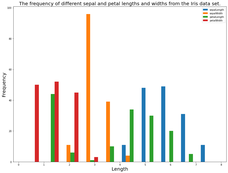
You now have an understanding of the basics of how to create histograms in Python using matplotlib. In the next section, we will learn how to use histograms to assess subcategories of a data set (similar to our discussion of subsets in the scatterplot lesson).
How To Assess Categorical Data Using Histograms in Python With Matplotlib
First, let's create three new data sets. The data sets will be the sepalWidth observation split across the three species in the data set: setosa, versicolor, and virginica.
You can do this with the following code:
iris_data = pd.read_json('https://raw.githubusercontent.com/nicholasmccullum/python-visualization/master/iris/iris.json')

setosa_data = iris_data[iris_data['species'] == 'setosa']['sepalWidth']

versicolor_data = iris_data[iris_data['species'] == 'versicolor']['sepalWidth']

virginica_data = iris_data[iris_data['species'] == 'virginica']['sepalWidth']
Next, let's plot a histogram of this data using the hist method. Instead of passing in one value for x, pass in a list whose elements are setosa_data, versicolor_data, and virginica_data, like this:
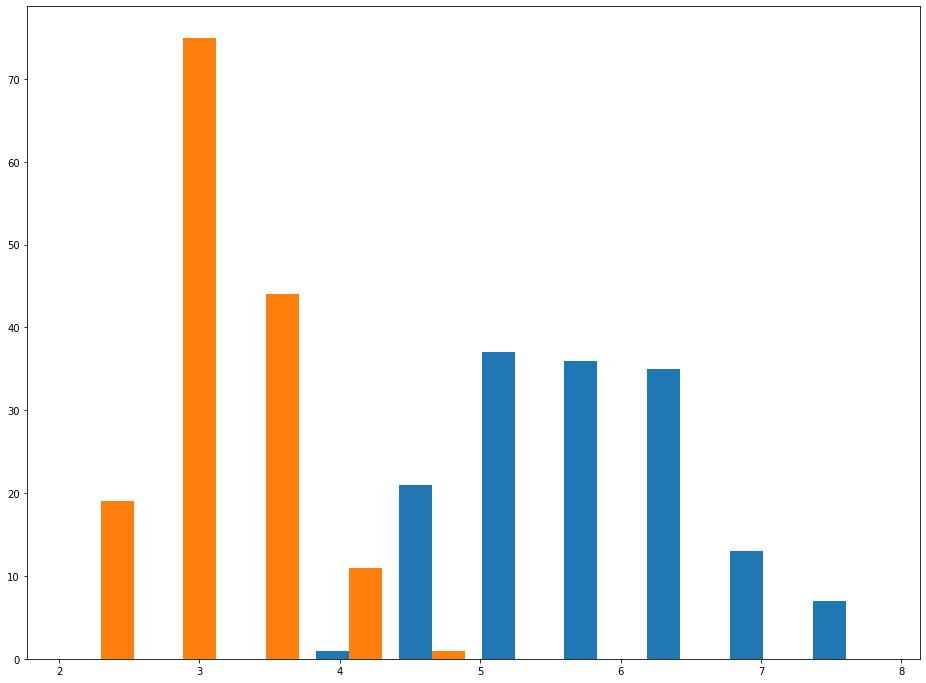
plt.hist([setosa_data,versicolor_data,virginica_data])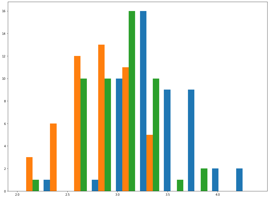
As you can see, this chart makes it relatively easy to see trends for sepalWidth among each species. This effect becomes even more pronounced if you increase the histogram's bin count, like this:
plt.hist([setosa_data,versicolor_data,virginica_data], bins = 30)
As before, the chart becomes much easier to interpret if we add a chart title, axis titles, and a legend.
We can do this with the following code:
plt.legend(['Setosa','Versicolor','Virginica'], fontsize=20)

plt.title('Differences in Sepal Width for the 3 flower species in the Iris data set.', fontsize=20)

plt.ylabel('Frequency', fontsize=20)

plt.xlabel('Length', fontsize=20)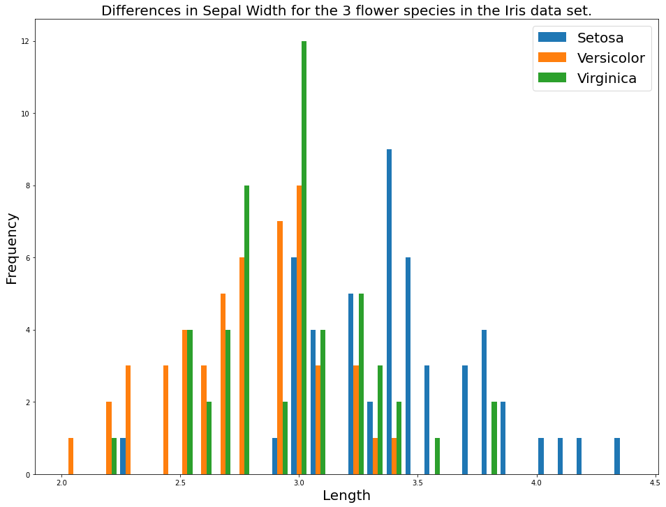
Moving On
In this lesson, you learned how to create histograms in Python using matplotlib.