
In this lesson, we'll be exploring the pyplot plot function and all of its associated attributes and arguments.
The Imports We'll Need For This Lesson
As before, I'm assuming you've run the following code before working through this lesson:
import matplotlib.pyplot as plt

%matplotlib inline

import numpy as np

from IPython.display import set_matplotlib_formats

set_matplotlib_formats('retina')
We will also be working with three random number datasets generated using NumPy's randn method:
data1 = np.random.randn(20)

data2 = np.random.randn(20)

data3 = np.random.randn(20)
These datasets are one-dimensional NumPy arrays with 20 entries.
Plotting Data Using Matplotlib's Plot Method
To start, let's plot one of these data sets using plt.plot():
plt.plot(data1)
If you want to change the x-values that are plotted along with the dataset, you could pass in another data set of length 20 before the data1 argument.
For example, let's say you wanted the x-axis to range from 20 to 40 instead of from 0 to 20. You would first create a new variable, which we will call xs, to hold the x-axis data points:
xs = range(20, 40)Then you would plot the chart with the new x-axis like this:
plt.plot(xs, data1)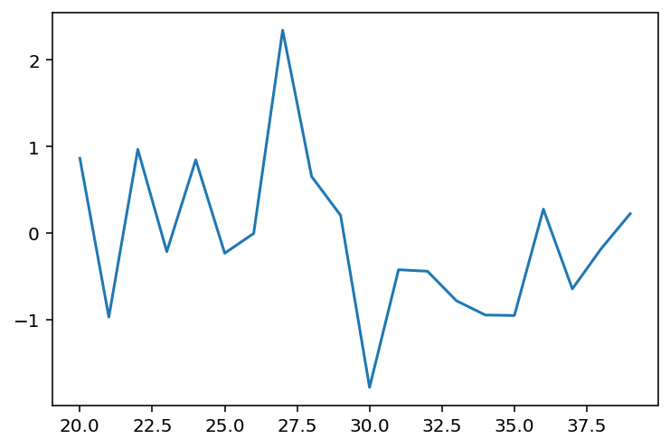
How To Format Your Matplotlib Graph Using Format Strings
You can also format the appearance of your plot using a format string. If the second or third argument of your plot method is a string, then matplotlib will automatically assume that this is meant to be a format string.
Format strings have three components:
marker: Specifies the shape that should be used on each data point.line: Specifies what type of line should be used, such as dotted line or solid line.color: Specifies the color of the line outside of the data points.
A few example of format strings are below:
plt.plot(xs, data1,'o--r')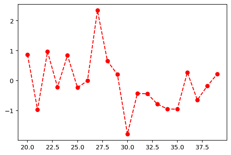
plt.plot(xs, data1,'+--c')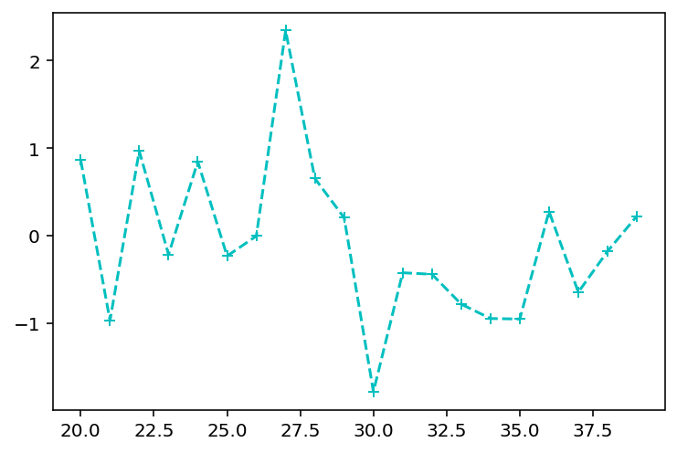
plt.plot(xs, data1,'s--y')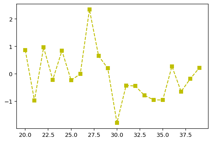
You definitely do not need to memorize all of the characteristics of matplotlib's format strings. If you ever get stuck while trying to create a specific format, visit matplotlib's documentation for help.
Plotting Multiple Datasets Using Matplotlib's Plot Function
As we have seen, it is possible to present multiple datasets on the same plot using matplotlib. This section will outline two methods for doing this.
The first method is by adding each dataset to the plot's canvas using a separate plot function, like this:
plt.plot(data1)

plt.plot(data2)

plt.plot(data3)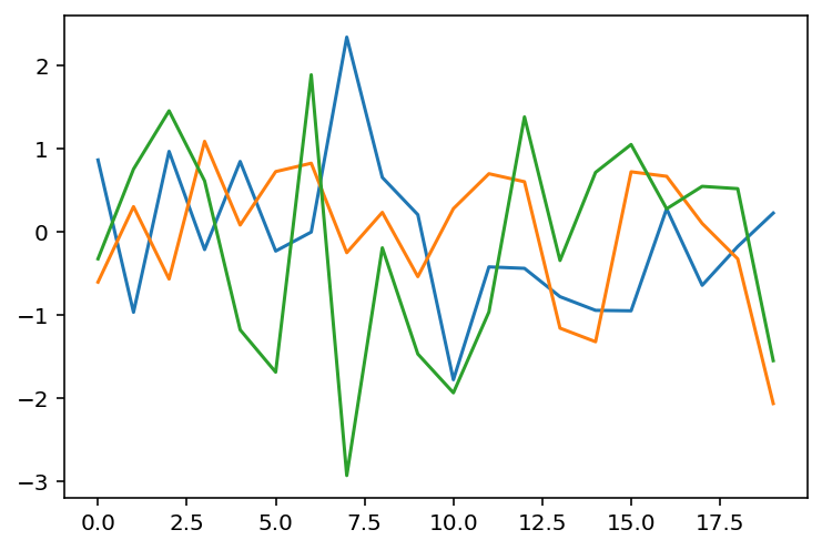
The second way is by using a single plot function.
Some caution is warranted here - you might think you can simply run plt.plot(data1, data2, data3), but this will cause an error. Specifically, your Jupyter Notebook will either plot an incorrect graph or return ValueError: third arg must be a format string.
This is because the second or third argument of a plot method must be a format string. The solution is to chain together sequences of data, formatString like this:
plt.plot(data1, '', data2, '', data3, '')Notice that I simply passed in an empty string for each dataset's format string. This makes matplotlib stick with the default format for each string, like this:
Refactoring Complex Graphs For Readability
There are many situtations where you will want to transform matplotlib's shorthand into longer code that is more readable for outside users.
To do this, we will transform the the plot function's format string into separate variables. An example of this is below, where I present two different ways to create an identical graph in matplotlib:
plt.plot(data1, 'r--s')

plt.plot(data1, color='red', linestyle='dashed', marker='s')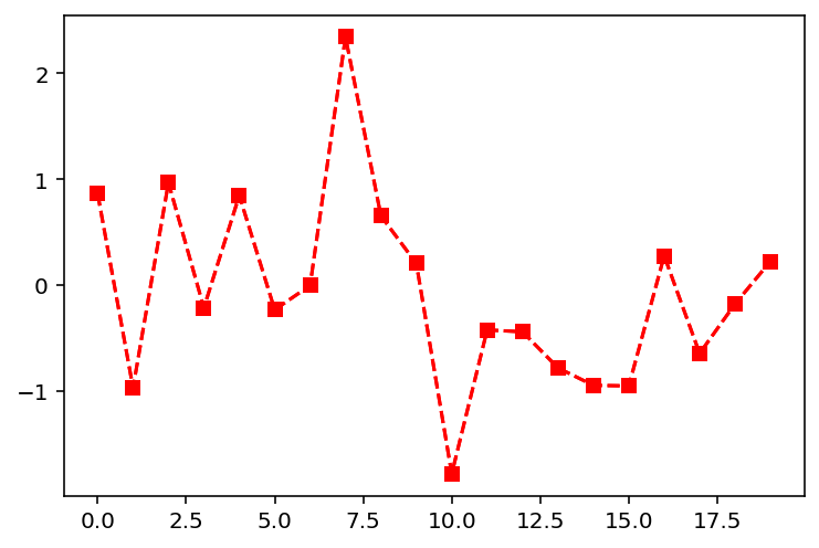
This becomes even more important when dealing with very complex graphs. For example, consider the following plot:
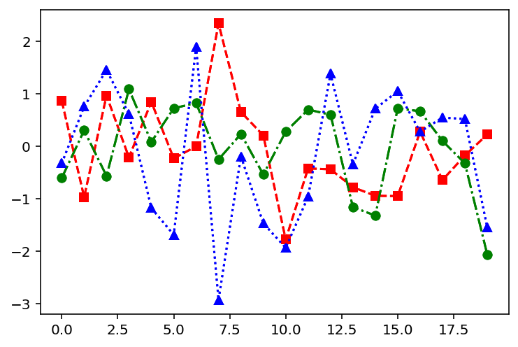
If you were an outside developer, which of the following two code blocks is easier for you to understand?
#Method 1

plt.plot(data1, 'r--s', data2, 'g-.o', data3, 'b:^')

#Method 2

plt.plot(data1, color='red', linestyle='dashed', marker='s')

plt.plot(data2, color='green', linestyle='dashdot', marker='o')

plt.plot(data3, color='blue', linestyle='dotted', marker='^')
For readability reasons, developers often refactor their code into longer examples before saving it or pushing it to some master repository.
Moving On
That concludes our discussion of matplotlib's pyplot function. After working through some practice problems, I will explain how you can build beautiful boxplots using matplotlib.