
In this lesson, we will discuss the fundamentals of the pyplot framework in matplotlib.
The Imports For This Lesson
For this lesson, we will need to run our standard matplotilb import as well as the magic function that allows us to display plots within the Jupyter Notebook:
import matplotlib.pyplot as plt

%matplotlib inline
I will also run the command to set my display to 'Retina Mode':
from IPython.display import set_matplotlib_formats

set_matplotlib_formats('retina')
Lastly, we will import the NumPy numerical computing library:
import numpy as npPyplot's Stateful Interface
Pyplot operates using what is called a stateful interface. This is essentially a fancy term that means that you can change the state of a plot after it is created.
In practice, this means that we generally create a plot in one step, and then modify the plot over time using a series of additional steps until it has the appearance and characteristics that we desire.
To see an example of this, let's create three random datasets using NumPy's randn function:
data1 = np.random.randn(10)

data2 = np.random.randn(10)

data3 = np.random.randn(10)
Note that since randn is a random number generator, each of these data sets will be different despite being generated using the same command.
Now let's plot each of these datasets using the plt.plot() method that we used earlier in this course. To do this, simply run multiple plt.plot() methods one after the other, like this:
plt.plot(data1)

plt.plot(data2)

plt.plot(data3)
Here's the output of that code (note that your plot may look slightly different since your randomly-generated datasets will be different than mine):
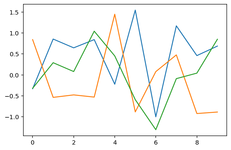
This is an excellent example of pyplot's stateful interface - instead of trying to plot all three data sets on one line, you can plot them one-by-one onto the same canvas.
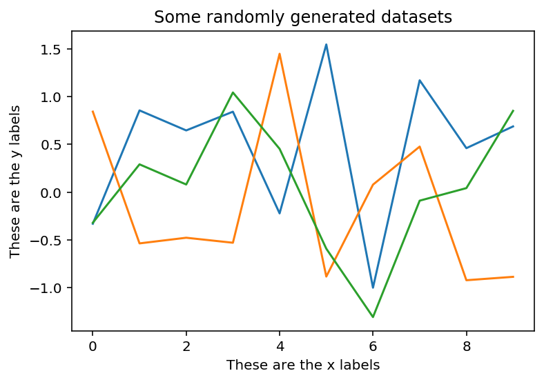
The same principle applies with other plot characteristics like titles and axis labels. You can use the title, xlabel, and ylabel methods to places titles on your chart:
plt.plot(data1)

plt.plot(data2)

plt.plot(data3)

plt.title("Some randomly generated datasets")

plt.xlabel("These are the x labels")

plt.ylabel("These are the y labels")
Here is the new output of this code:
Pyplot's Interactive Mode
Pyplot has an attribute called interactive mode that changes whether a plot is displayed after modifying it.
When interactive mode is turned on, the plot is displayed whenever it is modified. You can turn interactive mode on using plt.ion().
When interactive mode is turned off, the plot is not displayed whenever it is modified. In this case, you would display the plot using the plt.show() method. You can turn interactive mode off using plt.ioff.
If you are not sure whether or not you are currently operating in interactive mode, you can test this using plt.isinteractive(). It will return True if interactive mode is enabled and False if interactive mode is disabled.
If you test this in your Jupyter Notebook, you will notice that your plots will still display even if interactive mode is disabled. This is because of the %matplotlib inline command we executed at the beginning of this lesson.
You can disabled this forced plot display by executing the following code:
shell = get_ipython()

from ipykernel.pylab.backend_inline import flush_figures

shell.events.unregister('post_execute', flush_figures)
Moving On
In this lesson, we learned about the basics of matplotlib's pyplot interface. After working through some practice problems in the next section, we will explore pyplot's plot method in more detail.