
In this lesson, you will learn how to create scatterplots in Python using matplotlib.
The Imports You'll Need For This Lesson
This lesson will require the following imports:
import matplotlib.pyplot as plt

%matplotlib inline

import numpy as np

import pandas as pd

from IPython.display import set_matplotlib_formats

set_matplotlib_formats('retina')
You will also need to import the Iris dataset from this course's GitHub repository:
iris_data = pd.read_json('https://raw.githubusercontent.com/nicholasmccullum/python-visualization/master/iris/iris.json')What is a Scatterplot?
A scatterplot is a plot that positions data points along the x-axis and y-axis according to their two-dimensional data coordinates. An example of a scatterplot is below.
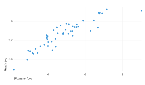
As this explanation implies, scatterplots are primarily designed to work for two-dimensional data. Accordingly, for most of the rest of this lesson we will drop all data from the Iris dataset except for sepalLength and petalLength. You can drop the unnecessary columns with the following code:
columns_to_drop = ['sepalWidth','petalWidth', 'species']

iris_data = iris_data.drop(columns_to_drop, axis=1)
How To Create Scatterplots in Python Using Matplotlib
To create scatterplots in matplotlib, we use its scatter function, which requires two arguments:
x: The horizontal values of the scatterplot data points.y: The vertical values of the scatterplot data points.
For starters, we will place sepalLength on the x-axis and petalLength on the y-axis. It might be easiest to create separate variables for these data series like this:
x = iris_data['sepalLength']

y = iris_data['petalLength']
Once this is done, you can place these variables inside the plt.scatter method to create your first box plot!
plt.scatter(x,y)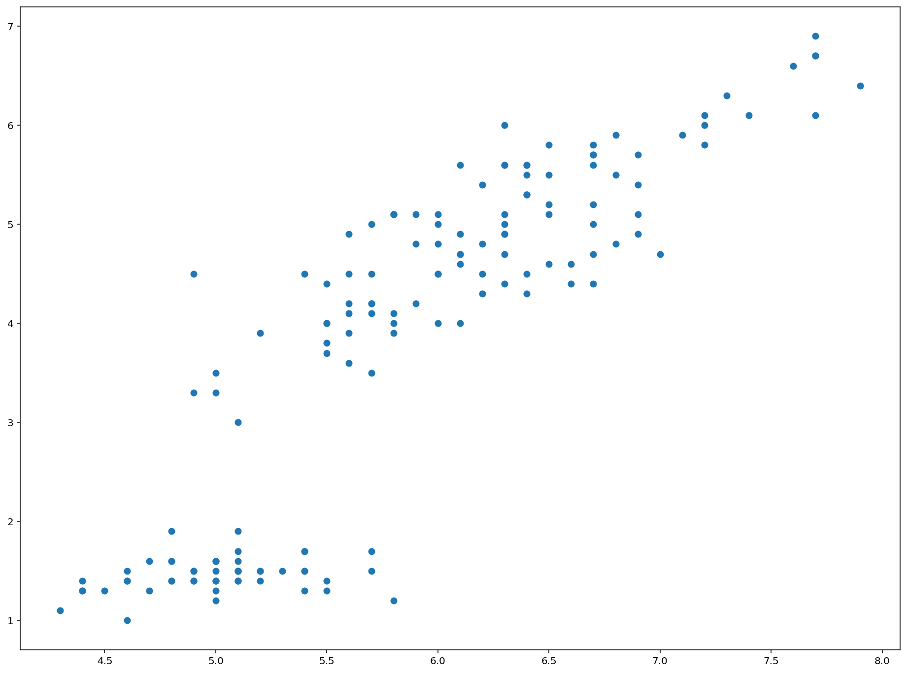
This is a great start! We will discuss how to format this new plot next.
How To Format Scatterplots in Python Using Matplotlib
There are a number of ways you will want to format and style your scatterplots now that you know how to create them.
Perhaps the most obvious improvement we can make is adding labels to the x-axis and y-axis. We can do this using matplotilb's xlabel and ylabel methods, like this:
plt.xlabel('Sepal Length')

plt.ylabel('Petal Length')
You might notice that these axis titles can be somewhat small by default. Fortunately, it is very easy to change the size of axis titles in matplotlib using the fontsize argument. As an example, you could change the font size of both axis titles to 20 by passing in fontsize=20 as a second argument like this:
plt.xlabel('Sepal Length', fontsize=20)

plt.ylabel('Petal Length', fontsize=20)
You can also change the title of the chart using the title method, which also accepts the fontsize argument:
plt.title('A Scatterplot of Sepal Length and Petal Length from the Iris Data Set', fontsize=25)You will also want to understand how to change the size and color of the datapoints within a matplotlib scatterplot. We will discuss both next.
The size of datapoints within a matplotlib scatterplot are determined by an optional variable s. The default value of s is 20 - so if you want your data points to be larger than normal, set s to be greater than 20. Conversely, if you want your data points to be smaller than normal, set s to be less than 20.
Here is an example where I increase the size of each data point by a factor of 10 (from 20 to 200) within a matplotlib scatterplot:
plt.scatter(x,y, s=200)

plt.xlabel('Sepal Length', fontsize=20)

plt.ylabel('Petal Length', fontsize=20)

plt.title('A Scatterplot of Sepal Length and Petal Length from the Iris Data Set', fontsize=25)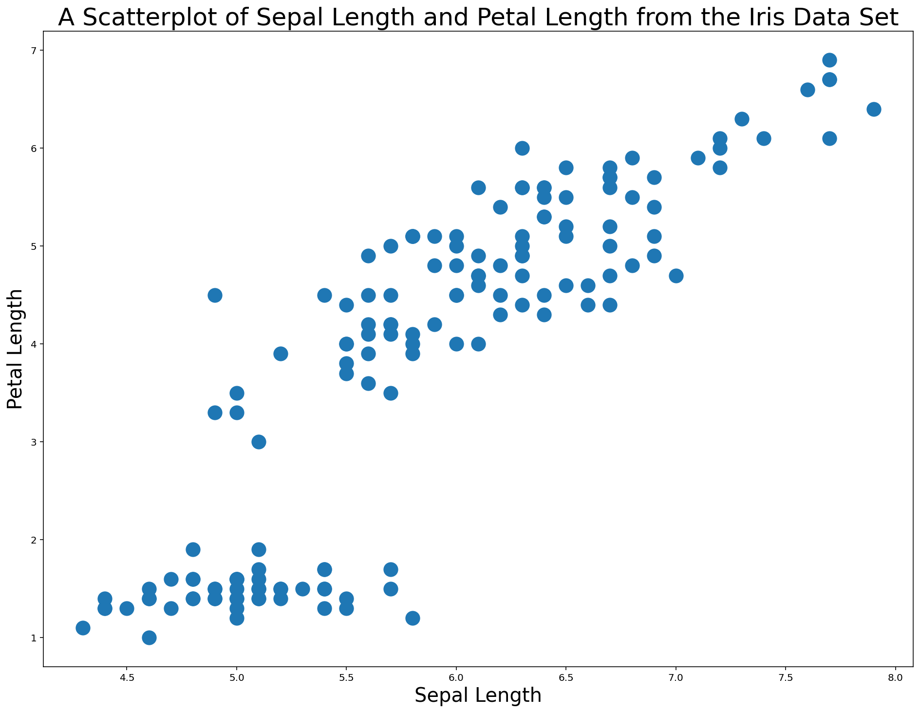
You can also change the color of the data points within a matplotlib scatterplot using the color argument. This argument accepts both hex codes and normal words, so the color red can be passed in either as red or #FF0000.
An example of changing this scatterplot's points to red is below.
plt.scatter(x,y, s=200, color='red') #Note - could also use 'color='#FF0000''

plt.xlabel('Sepal Length', fontsize=20)

plt.ylabel('Petal Length', fontsize=20)

plt.title('A Scatterplot of Sepal Length and Petal Length from the Iris Data Set', fontsize=25)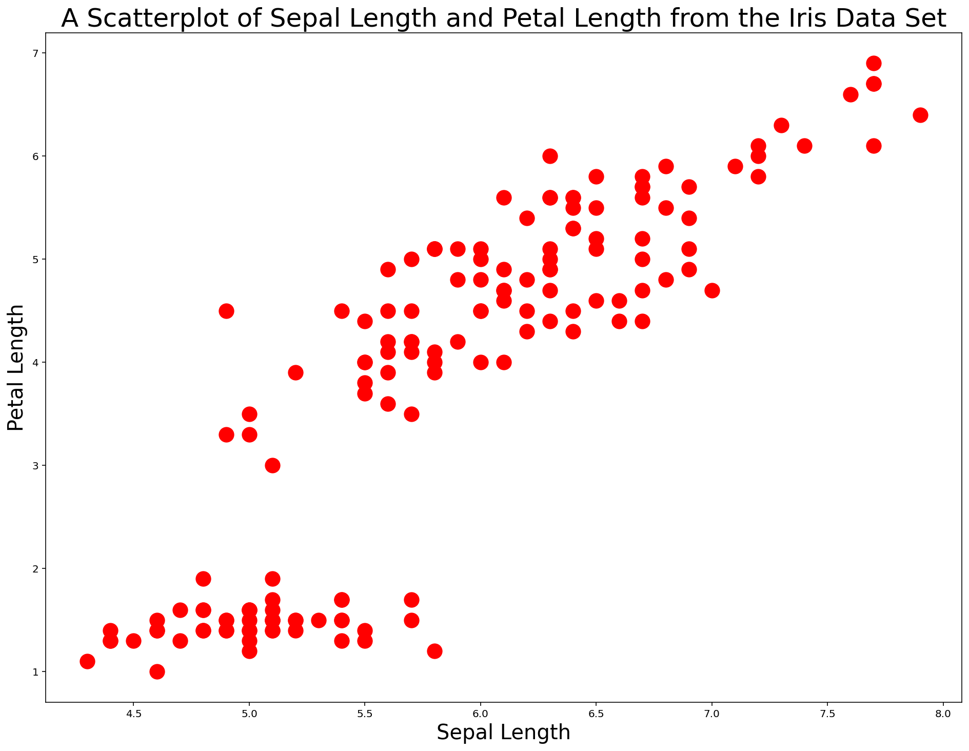
Scatterplots are an excellent tool for quickly assessing whether there might be a relationship in a set of two-dimensional data. We can also use scatterplots for categorization, which we explore in the next section.
How To Use Scatterplots To Categorize Data in Python Using Matplotlib
To start this section, we are going to re-import the Iris dataset. Instead of dropping all data except for sepalLength and petalLength, we are going to include species this time as well. This gives us three data points: sepalLength, petalLength, and species.
The following code does the trick:
iris_data = pd.read_json('https://raw.githubusercontent.com/nicholasmccullum/python-visualization/master/iris/iris.json')

columns_to_drop = ['sepalWidth','petalWidth']

iris_data = iris_data.drop(columns_to_drop, axis=1)
Let's again create our x and y variables using the same code as before.
This time, we will create a new variable called species, which refers to the column of the DataFrame with the same name:
x = iris_data['sepalLength']

y = iris_data['petalLength']

species = iris_data['species']
For this new species variable, we will use a matplotlib function called cmap to create a "color map". A color map is a set of RGBA colors built into matplotlib that can be "mapped" to specific values in a data set.
Alongside cmap, we will also need a variable c which is can take a few different forms:
- A single string representing a color
- A sequence of color specifications
- A 2D array in which the rows are RGB or RGBA
This is a bunch of jargon that can be simplified as follows:
- Matplotlib allows us to map certain categories (in this case,
species) to specific colors - We can apply this formatting to a scatterplot
One other important concept to understand is that matplotlib includes a number of color map styles by default. Matplotlib's color map styles are divided into various categories, including:
- Perceptually Uniform Sequential
- Sequential
- Diverging
- Qualitative
- Miscellaneous
A list of some matplotlib color maps is below.
Perceptually Uniform Sequential

['viridis', 'plasma', 'inferno', 'magma']

Sequential

['Greys', 'Purples', 'Blues', 'Greens', 'Oranges', 'Reds', 'YlOrBr', 'YlOrRd', 'OrRd', 'PuRd', 'RdPu', 'BuPu', 'GnBu', 'PuBu', 'YlGnBu', 'PuBuGn', 'BuGn', 'YlGn']

Sequential (2)

['binary', 'gist_yarg', 'gist_gray', 'gray', 'bone', 'pink', 'spring', 'summer', 'autumn', 'winter', 'cool', 'Wistia', 'hot', 'afmhot', 'gist_heat', 'copper']

Diverging

['PiYG', 'PRGn', 'BrBG', 'PuOr', 'RdGy', 'RdBu', 'RdYlBu', 'RdYlGn', 'Spectral', 'coolwarm', 'bwr', 'seismic']

Qualitative

['Pastel1', 'Pastel2', 'Paired', 'Accent', 'Dark2', 'Set1', 'Set2', 'Set3', 'tab10', 'tab20', 'tab20b', 'tab20c']

Miscellaneous

['flag', 'prism', 'ocean', 'gist_earth', 'terrain', 'gist_stern', 'gnuplot', 'gnuplot2', 'CMRmap', 'cubehelix', 'brg', 'hsv', 'gist_rainbow', 'rainbow', 'jet', 'nipy_spectral', 'gist_ncar']
To create a color map, there are a few steps:
- Determine the unique values of the
speciescolumn - Create a new list of colors, where each color in the new list corresponds to a string from the old list
- Pass in this list of numbers to the
cmapfunction
We will go through this process step-by-step below.
First, let's determine the unique values of the species variable that we created by wrapping it in a set function:
set(species)

#Returns {'setosa', 'versicolor', 'virginica'}
There are three unique values. We will assign them the numerical values of 0, 1, and 2.
There are two obvious ways that you could do this.
The first way is to create an empty list (which I have named colorNumbers in the following code) and then looping through every element in the species variable. Within that loop, you can use if statements to add the right number to the append method, like this:
colorNumbers = []

for z in species:

    if (z == 'setosa'):

        colorNumbers.append(0)

    if (z == 'versicolor'):

        colorNumbers.append(1)

    if (z == 'virginica'):

        colorNumbers.append(2)

colorNumbers
The problem with this method is that it would not scale to very large data sets. For example, if there were 100 categories instead of 3 categories, you would have to manually write out 3 if statements.
The second way to do this would be to nest this within another loop that counts the number of unique elements in species and creates the right number of if statements in response. This is a more sophisticated technique that is beyond the scope of this course.
Now that we have our list of color numbers, we can create our first scatterplot that uses different colors for each category! You can do so with the following code:
plt.scatter(x,y, s=200, c=colorNumbers, cmap='viridis')

plt.xlabel('Sepal Length', fontsize=20)

plt.ylabel('Petal Length', fontsize=20)

plt.title('A Scatterplot of Sepal Length and Petal Length from the Iris Data Set', fontsize=25)
To recap the contents of the scatter method in this code block, the c variable contains the data from the data set (which are either 0, 1, or 2 depending on the flower species) and the cmap variable viridis is a built-in color scheme from matplotlib that maps the 0s, 1s, and 2s to specific colors.
The output of this code is below.

As you can see, this code makes it very easy to see the different flower species in this diagram.
However, there is still a problem. The plot does not have a legend to allow us to differentiate between the flower species!
To fix this, we first need to create a separate object (which I call viridis) to store some color values for us to reference later. You can do this using the following code:
viridis = plt.cm.get_cmap('viridis', 3)Next, we need to create three 'fake' scatterplot data series that hold no data but serve to allow us to label the legend. An example is below:
plt.scatter([], [], marker='o', label='setosa', edgecolors = viridis(0), c=viridis(0))This data series wil label the setosa species, and its colors are 0.
Our next step is to create data series for the versicolor and virginica species and wrap all three data series in a list. I call the list legend_aliases:
viridis = plt.cm.get_cmap('viridis', 3)

legend_aliases = [
    plt.scatter([], [], marker='o', label='setosa', edgecolors = viridis(0), c=viridis(0)),
    plt.scatter([], [], marker='o', label='versicolor', edgecolors = viridis(1), c=viridis(1)),
    plt.scatter([], [], marker='o', label='virginica', edgecolors = viridis(2), c=viridis(2))
]
Once legend_aliases is created, we can create the legend the plt.legend() method:
plt.scatter(x,y, s=200, c=colorNumbers, cmap='viridis')

plt.xlabel('Sepal Length', fontsize=20)

plt.ylabel('Petal Length', fontsize=20)

plt.title('A Scatterplot of Sepal Length and Petal Length from the Iris Data Set', fontsize=25)

viridis = plt.cm.get_cmap('viridis', 3)

legend_aliases = [
    plt.scatter([], [], marker='o', label='setosa', edgecolors = viridis(0), c=viridis(0)),
    plt.scatter([], [], marker='o', label='versicolor', edgecolors = viridis(1), c=viridis(1)),
    plt.scatter([], [], marker='o', label='virginica', edgecolors = viridis(2), c=viridis(2))
]

plt.legend(handles=legend_aliases, loc='upper center')
Note that if you wanted the species to be listed side-by-side in the legend, you can specifiy ncol=3 like this:
plt.legend(handles=legend_aliases, loc='upper center', ncol=3)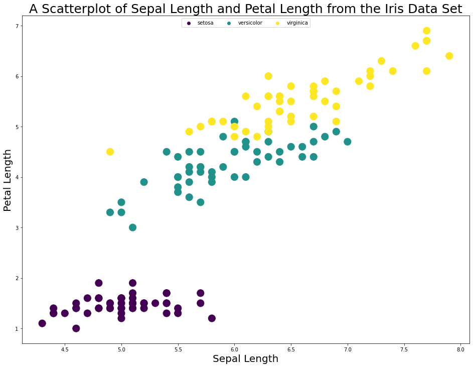
As you can see, assigning different colors to different categories (in this case, species) is a useful visualization tool in matplotlib.
In the next section of this article, we will learn how to visualize 3rd and 4th variables in matplotlib by using the c and s variables that we have recently been working with.
How To Deal With More Than 2 Variables in Python Visualizations Using Matplotlib
As a data scientist, you will often encounter situations where you need to work with more than 2 data points in a visualizations. There are two ways of doing this.
First, you can change the size of the scatterplot bubbles according to some variable. To use the Iris dataset as an example, you could increase the size of each data point according to its petalWidth.
Secondly, you could change the color of each data according to a fourth variable. For example, you could change the data's color from green to red with increasing sepalWidth.
To demonstrate these capabilities, let's import a new dataset.
UC Irvine maintains a very valuable collection of public datasets for practice with machine learning and data visualization that they have made available to the public through the UCI Machine Learning Repository.
We will be importing their Wine Quality dataset to demonstrate a four-dimensional scatterplot.
You can import this dataset with the following Python command:
wine_data = pd.read_csv('http://archive.ics.uci.edu/ml/machine-learning-databases/wine-quality/winequality-red.csv', sep=';')Let's take a look at what is contained in the data by investigating the columns of the DataFrame:
wine_data.columns

#Returns Index(['fixed acidity', 'volatile acidity', 'citric acid', 'residual sugar',
#       'chlorides', 'free sulfur dioxide', 'total sulfur dioxide', 'density',
#       'pH', 'sulphates', 'alcohol', 'quality'],
#      dtype='object')
To demonstrate a four-dimensional scatterplot, let's plot fixed acidity on the x-axis, volatile acidity on the y-axis, residual sugar as the size of the data points, and pH as the color of the data points.
I create each of these variables below:
x = wine_data['fixed acidity']

y = wine_data['volatile acidity']

s = wine_data['residual sugar']

c = wine_data['pH']
It is now time to create the chart! I will be using the RdPu color map template from matplotlib since it roughly matches the color scheme of a nice red wine. Kudos to this Medium article for the color scheme idea.
Here is the code:
plt.scatter(x, y, c=c, s=s, cmap='RdPu')

plt.xlabel('Fixed Acidity', fontsize=20)

plt.ylabel('Volatile Acidity', fontsize=20)

plt.title('A Scatterplot of Wine Characteristics (Size = Residual Sugar)', fontsize=25)
After looking at this chart, I believe there are two obvious improvements that we can make before concluding this lesson.
First, I think the size of each datapoint should be improved. A 10x increase should do it. Replace s=s with s=s*10 and the chart is immediately more interpretable:
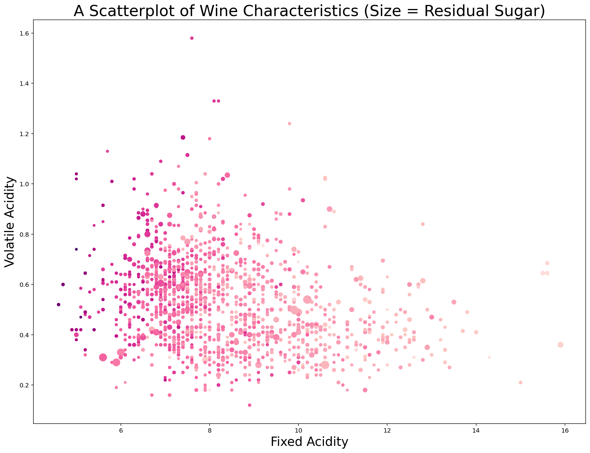
Second, we can add a colorbar to the plot that provides some context for the different colors of the data points. Specifically, I use the last line of the following code block to create a color bar with a label of pH with a fontsize of 20:
plt.scatter(x, y, c=c, s=s*10, cmap='RdPu')

plt.xlabel('Fixed Acidity', fontsize=20)

plt.ylabel('Volatile Acidity', fontsize=20)

plt.title('A Scatterplot of Wine Characteristics (Size = Residual Sugar)', fontsize=25)

plt.colorbar().set_label('pH', rotation=0, fontsize=20)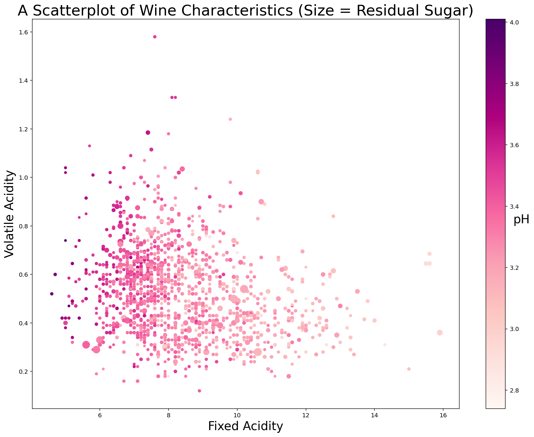
Moving On
In this lesson, we learned all about how to create scatterplots in Python using matplotlib. I know that we discussed a lot in this lesson and it can seen overwhelming. Keep practicing and you'll get the hang of it soon!