
What is Exploratory Data Analysis?
Exploratory data analysis (EDA) is a critical component of any data scientist's tool box. EDA involves learning about a data set to make sure you're using the right predictive tools to analyze it.
Despite their importance, exploratory data analysis principles are seldom taught. They are learned through the course of building many real data science projects.
This tutorial will teach you the basics of exploratory data analysis in Python.
Table of Contents
You can skip to a specific section of this exploratory data analysis tutorial using the table of contents below:
- What is Exploratory Data Analysis (EDA)?
- Why is EDA Important?
- A Simple EDA Exercise in Python
- Final Thoughts
What is Exploratory Data Analysis (EDA)?
Exploratory data analysis (EDA) is used to analyze a data set to assess its nature and characteristics. EDA primarily uses visualization techniques to do this.
The objectives of EDA are
- To understand the distribution of the dataset
- To identify potential patterns and trends
- To identify outliers or anomalies
- To produce a hypothesis
- To validate assumptions
- To generate a visually-summarized representation of the dataset
Why is EDA Important?
Although many tend to skip it, exploratory data analysis is an essential step in any data science project. It helps you understand whether the model you're applying to the data will be logical, well-defined, and scoped within the boundaries of its intended application.
EDA also helps to find anomalies, errors, noise, loss of data, and the overall validity of the data set with respect to the application.
Performing EDA helps you in modeling outcomes, determining the best-suited algorithm, finding new data patterns, and even defining which variables are dependent and independent.
Using proper exploratory data analysis techniques can save you from building invalid or erroneous models, building models on unsuitable data, selecting unsuitable variables, and even unoptimized development of the model. EDA can be helpful in preparing data for the model as well (this is typically called data cleaning).
EDA can also save you from making bad predictions by revealing that your data set is not adequate for the task at hand. This means you'll need to go back to the data collection stage.
To summarize, the main goal of EDA is to ensure that the dataset aligns with the model that you're building. The rest of this article will explain a few methods you can use to perform exploratory data analyses.
Methods to Perform EDA
There are many methods that can be used for exploratory data analysis.
Note that as with everything else, it's often best to use multiple EDA techniques. You can then compare the results of each analysis to see if they align with each other.
Univariate Visualization
This method can be used to produce a statistical summary for each separate column of the unprocessed dataset.
Bivariate Visualization
This method is used to determine the connection between each independent variable and the intended dependent variable.
Multivariate Visualization
This method can be used to understand the relationship between different columns of the dataset.
Dimensionality Reduction
In simple terms, dimensionality reduction can be used to reduce the number of dimensions in a dataset and transform to another dimensional space that is lower than the original while still sustaining the meaningful and resourceful characteristics of the dataset.
Principal component analysis is one of the most common techniques used for dimensionality reduction.
Dimensionality reduction methods can be used to develop questions to answer during your analysis or to develop a sense of how the results of this model should be interpreted. The usual procedure to perform exploratory data analysis in your code is as follows.
- Acquire a suitable dataset and import it
- Understand the nature of the dataset by observing data from different rows.
- Try to further understand the nature of the dataset by querying the data
- Identify if there are any missing values and determine how the handle the missing data
- Try to comprehend the features of the dataset from a data science standpoint
- Identify the difficulties of working with the dataset due to its missing and extreme values.
- Identify any potential patterns even if they cannot be explained right away
This process is often encompassed by a step called data profiling.
Data profiling is performed after summarizing the dataset using visualization and statistics to help you understand the dataset even better.
Based on the outcome of data profiling, the next steps can be decided regarding the dataset whether or not to rectify or reject depending on the suitability to the potential machine learning model.
We will now put everything we have learned to practice.
A Simple EDA Exercise in Python
We will now get started with getting ourselves familiar with the basics of exploratory data analysis by practicing on a dataset.
We will be using the Cortex cryptocurrency dataset in this exercise.
You'll also need the following libraries as a prerequisite:
Pandas is a highly optimized Python library written for manipulation and analysis of data. It is well-known for its highly useful pandas DataFrame data structure.
NumPy is one of the most versatile libraries intended towards mathematical and numerical computations on matrices of various dimensions. It's NumPy array data structure is similar to a Python list, but is more well-suited towards high-performance computing.
Matplotlib is a Python library that is written for the visualization of data.
- Seaborn
Seaborn is a library that is based on Matplotlib and it helps to make visualizations of data easier.
We will now install the above libraries using the pip package manager. Run the following statements on your command line to do this:
pip install pandas
pip install numpy
pip install matplotlib
pip install seaborn
Additionally, we also require the datapackage library to be installed. This is because we are directly importing data through a remote server.
pip install datapackageNow that our imports are complete, you can import the data for this tutorial with the following code:
import pandas as pd
import datapackage
remote_url = 'https://datahub.io/cryptocurrency/cortex/datapackage.json'
my_pkg = datapackage.Package(remote_url)
my_rsc = my_pkg.resources
for rsc in my_rsc:
	if rsc.tabular:
		df = pd.read_csv(rsc.descriptor['path'])
df
The last line of this code block will output the data as follows.
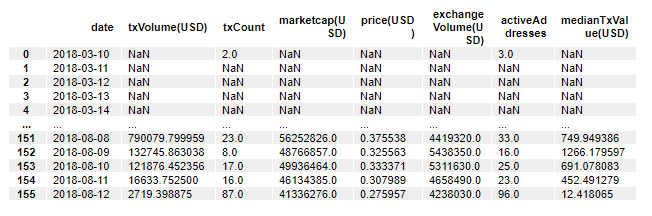
If we look at the fields within this data set, we will see that there are 8 columns (in addition to the index column).
For this exercise, you don't need to know what each column means from the start. Just know that they are variables. You will get familiar with each specific column as you work through this tutorial.
If you want to learn the shape of the data set, you can easily run the following command to get the number of columns and rows.
df.shapeHere's the output of this command:
(156, 8)This means the above dataset has 156 observations and 8 features.
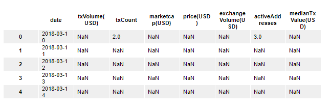
In addition to that, by running the following head and tail statements, you can print the first five rows and the last five rows from the dataset.
df.head()This prints:
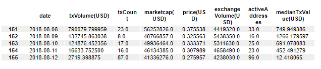
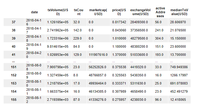
Similarly, here's how you can print the tail of the data set:
df.tail()This prints:
As we noticed in the first five observations, the data set contains null values. It's important to understand how prevalent these null values are in the rest of the dataset.
The info method is an excellent tool for learning more about missing data in a pandas DataFrame.
df.info()This generates:
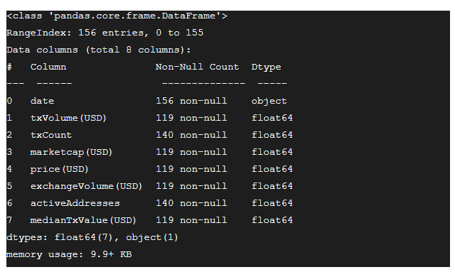
The output of the info method tells us that except for the date field, all the other fields have float values.
Moreover, except for in the date column, every other field has NaN values.
We have a few options on how to deal with this missing data:
- go ahead with the existing table
- replace the
NaNvalues with another value - discard all the observations that have
NaNvalues
In this scenario, let’s choose the last option and drop all the observations with NaN fields. We'll use the pandas dropna method to do this:
df = df.dropna()
df
Here's what the new DataFrame looks like:
To see how many rows have been removed from our data set, we can look at the DataFrame's shape attribute:
df.shapeHere's the output of this code:
(119, 8)You can tell that our data set has dropped from 156 observations originally to 119 observations now. This shows that there were 37 observations with missing data in the original data set.
You'll also notice that the DataFrame's indices start from 37 and have lost their consistency. You can reset the indices of the DataFrame using the reset_index method, like this:
df = df.reset_index(drop = True)This will reset the indices of the DataFrame. Note that we've passed a drop = True argument into the reset_index method because we do not require the old indices to be included in the new DataFrame as another column.
We can now use the pandas.describe() function to look at a summary of all the fields using statistics like means, percentiles, standard deviation, minimums, and maximums.
df.describe()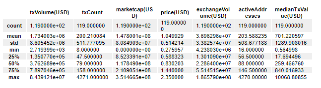
If you want to know the median of a particluar column, it's not explicitly labelled here. With that said, the median is just another name for the 50th percentile.
You can see from this output that the difference between the 50th percentile and the 75th percentile of txCount field is much greater than the difference between the 25th percentile and the 50th percentile.
The describe method also shows similar characteristics for some of the other fields. In many columns, the mean is significantly higher than its median.
Both these observations suggest that there are outliers in the dataset.
Provided that this dataset had lots of similar values or repeated values, we could have used the unique() function to observe all the unique values from each field. In addition, the value_counts() method shows the number of times each value in a column occurs.
Take your own time and try to observe more patterns in the dataset. There could be hundreds of different patterns that are just waiting to be found!
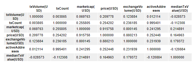
Now that we are a bit familiar with the nature of this dataset, we can produce a correlation matrix for this dataset using the corr() function.
Correlation matrices are highly useful in summarizing massive amounts of data and to identify patterns among the different fields. They also allow us to perform diagnostics to find if certain variables are extremely correlated to each other. This indicates multicollinearity and would suggest that some types of modelling (such as linear regressions) would produce unreliable predictions.
Here's the code to generate a correlation matrix from the DataFrame:
df.corr()Here's the output of this code:
You'll also want to use the seaborn library we installed earlier to generate some visualizations. Let's start by importing the library into our script:
import seaborn as sns
import matplotlib.pyplot as plt
One of my favorite seaborn visualizations is the heatmap. Here's the code to generate a basic heatmap using seaborn that presents our correlation matrix in a visually-appealing manner:
sns.heatmap(df.corr(), annot=True)
plt.show()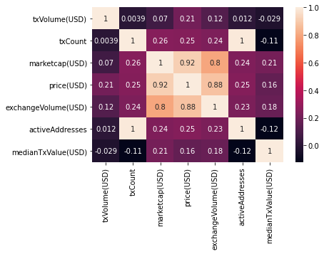
This visualization reveals that txCount has a very strong positive correlation with activeAddresses.
Why is this?
If we consider what txCount actually is, it is a field that denotes the number of blockchain transactions that a specific user has completed. The field activeAddresses represents the number of individual addresses that have engaged in blockchain transactions with that specific user. With this in mind, it makes sense that these two fields have a high correlation.
There are many more such patterns in this data set. Try and identify more of the. It's a great way to practice your exploratory data analysis skills!
You can also look at how the price has changed over the available dates. Let's first see if there are any duplicate dates. As you already know, there are 119 observations. Let's produce the array of unique values in the date field and find its length:
len(df['date'].unique())This returns:
119Since then number of unique dates is equal to the number of total dates, this shows that all dates are unique.
It also shows that the dates are in chronological order even with the NaN values dropped.
Let's produce a matplotlib scatterplot to see how the prices have changed over the months:
import matplotlib.pyplot as plt
plt.scatter(df['date'],df['price(USD)'])
plt.xlabel('Timeline')
plt.ylabel('Price')
plt.show()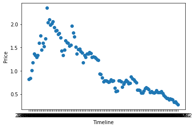
We can also produce a scatterplot that shows how the number of active addresses has varied over the months.
import matplotlib.pyplot as plt
plt.scatter(df['date'],df['activeAddresses'])
plt.xlabel('Active Addresses')
plt.ylabel('Price')
plt.show()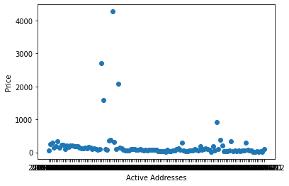
From the description we produced earlier, we know that the mean for active addresses is approximately 204.
We also observed that on some dates, there are numbers as high as 4270 and numbers as low as 16.
The charts we just created allow us to observe those outliers in a visual way.
There are many more patterns in this data set that are best observed visually. Feel free to produce more plots involving other fields that might be useful in inferring important information in this exploratory data analysis step.
Final Thoughts
Exploratory data analysis is used to summarize and analyze data using techniques like tabulation and visualization.
Using EDA in statistical modeling can be extremely useful in determining the best-suited model for the problem at hand. Moreover, it also helps in identifying unseen patterns in a dataset.
This tutorial provided a broad overview of exploratory data analysis techniques. Please feel free to use it as a reference when approaching new data science problems in the future.